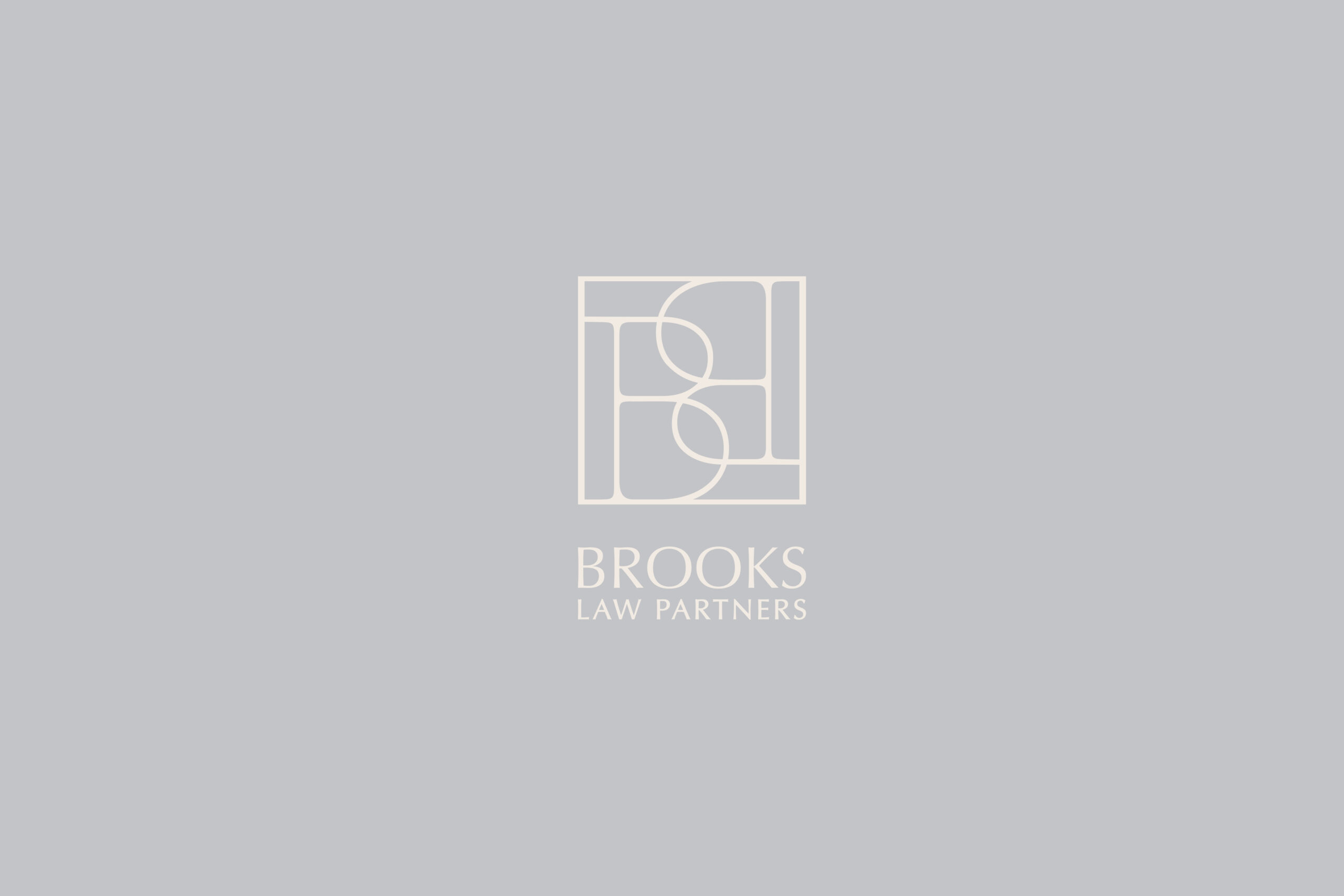
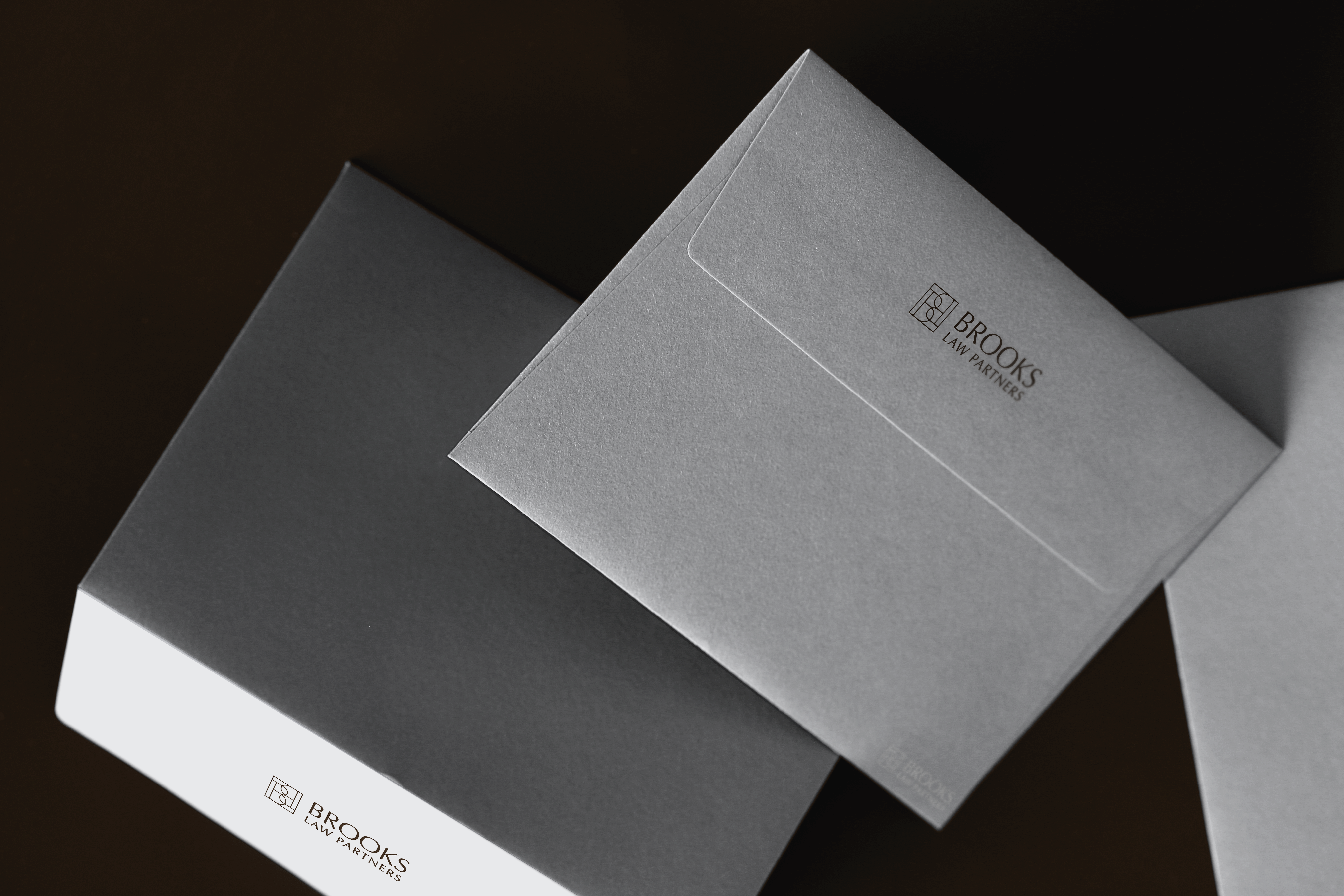
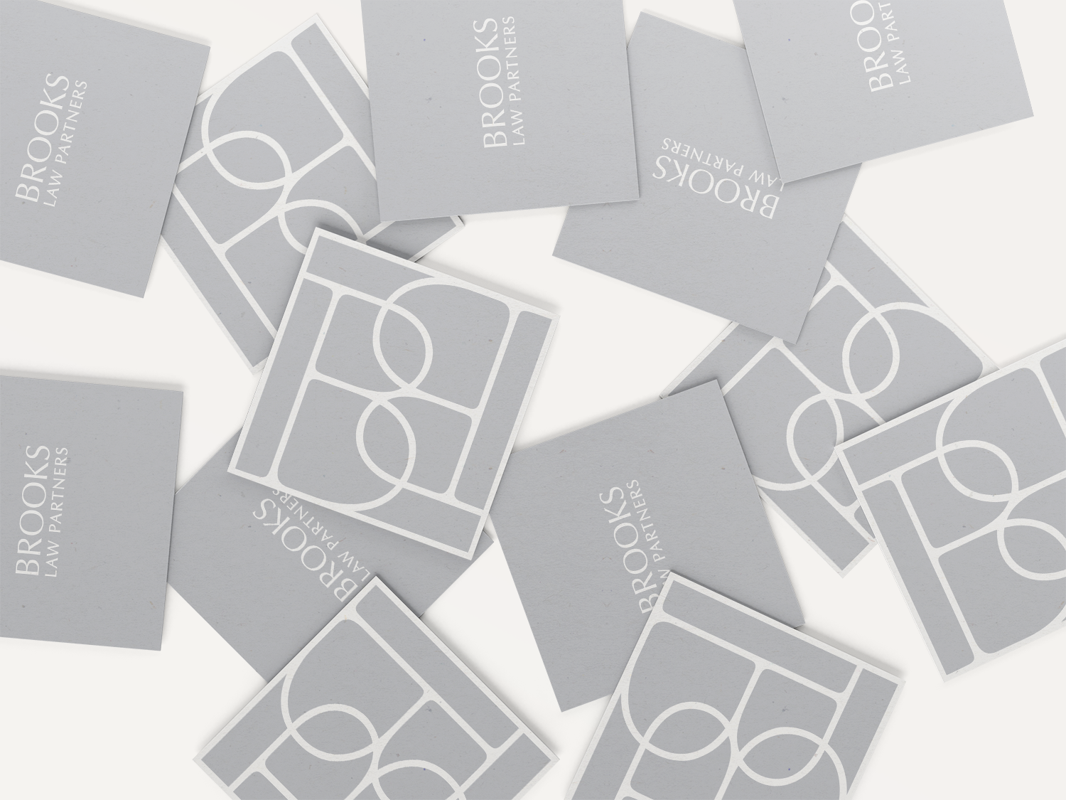
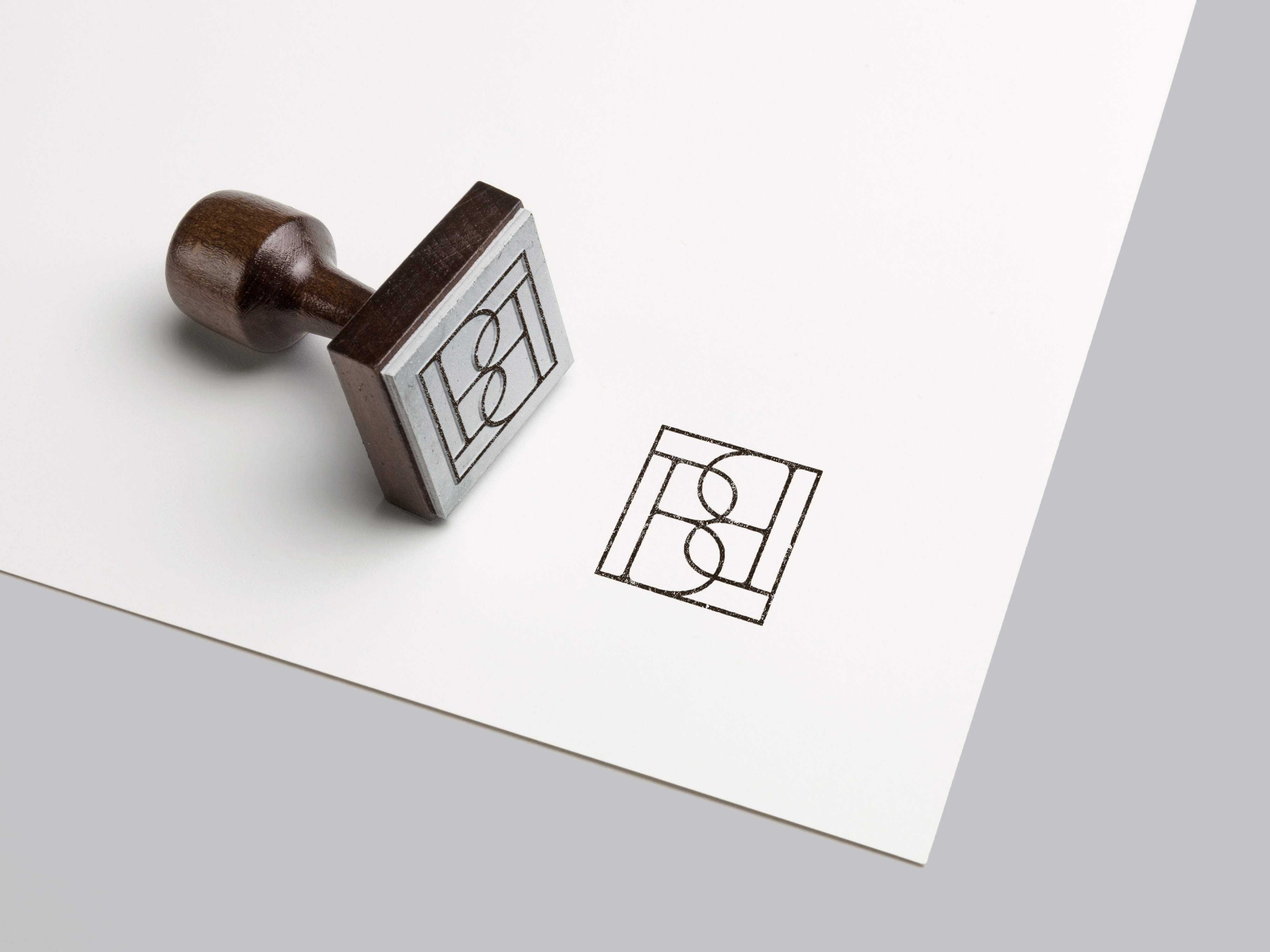
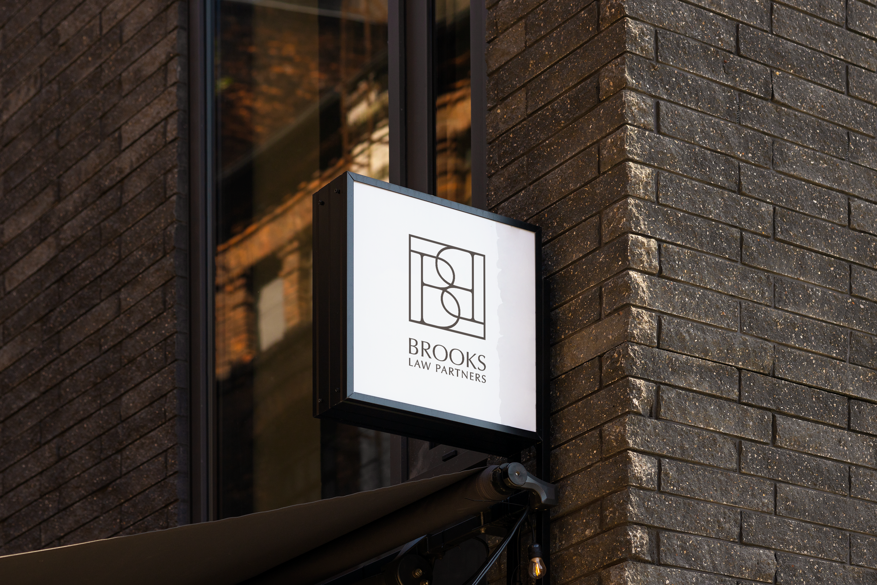
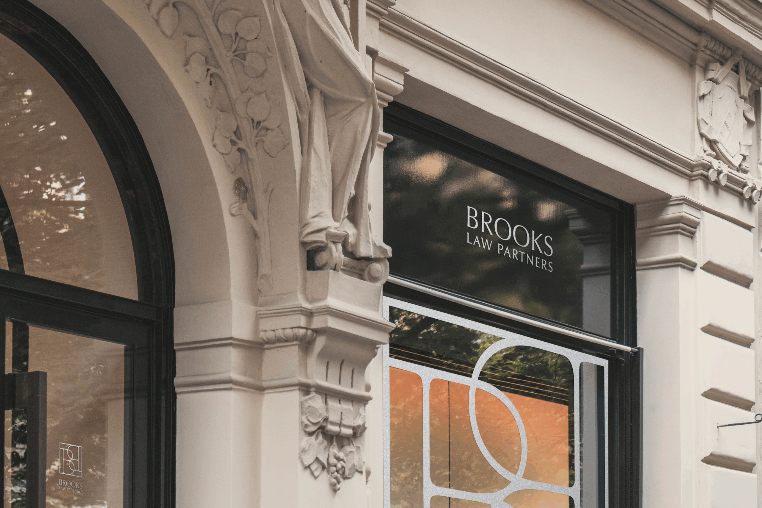
A custom visual identity for a woman-led law firm, designed to reflect its dual nature: strong yet approachable. The brandmark features a mirrored monogram, using symmetry to reference partnership and balance. Its stamp-like structure subtly nods to the legal field without relying on familiar industry symbols. Typography centers around a typeface that balances serif and sans serif characteristics, reflecting a relationship between tradition and contemporary practice. A palette of muted cream, gray and brown supports the identity with a calm and refined presence.