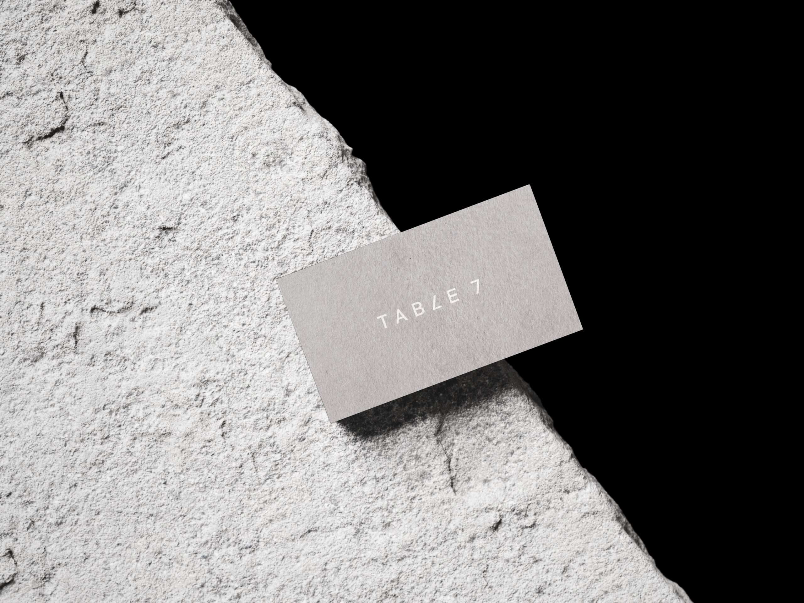
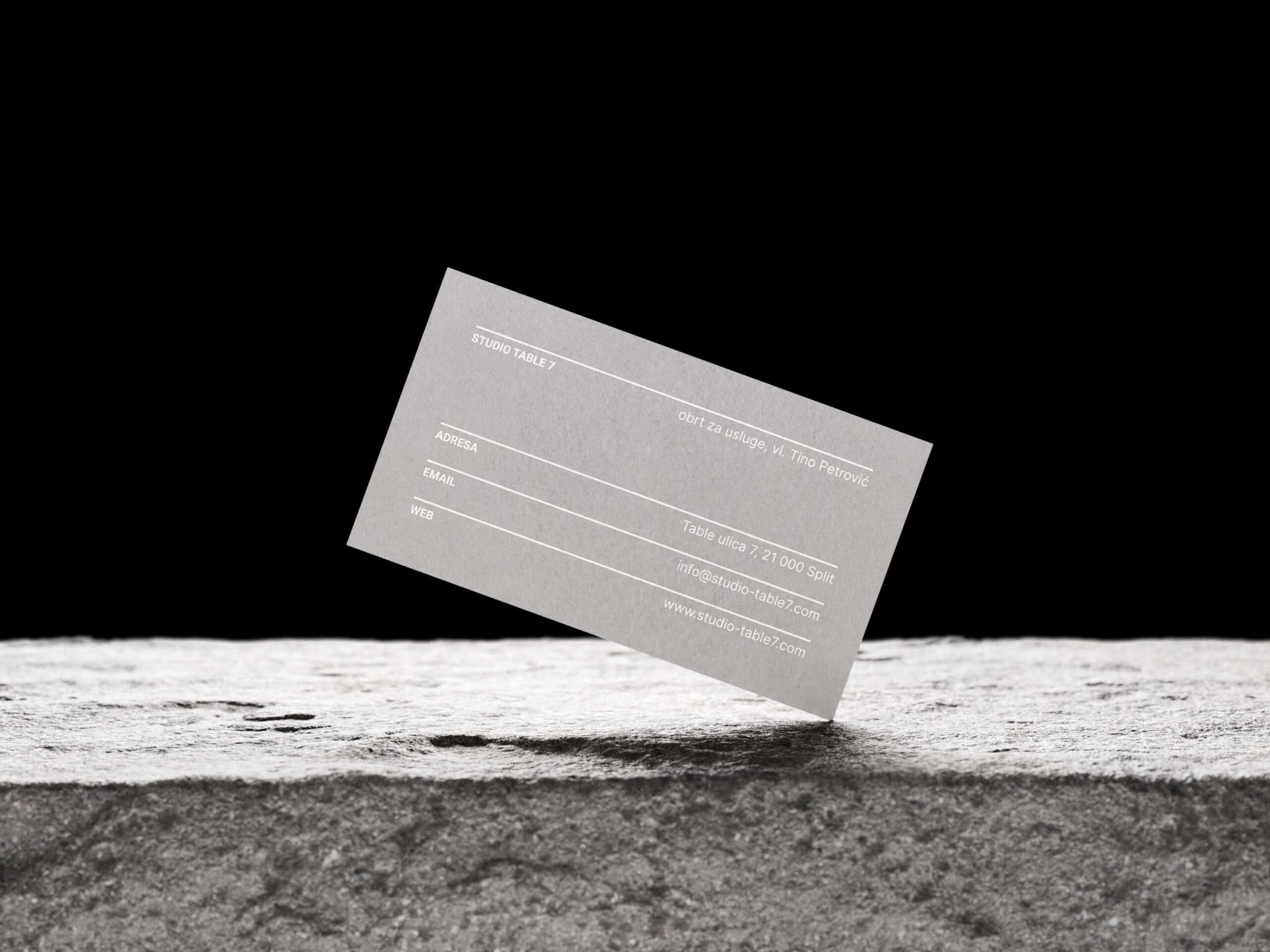
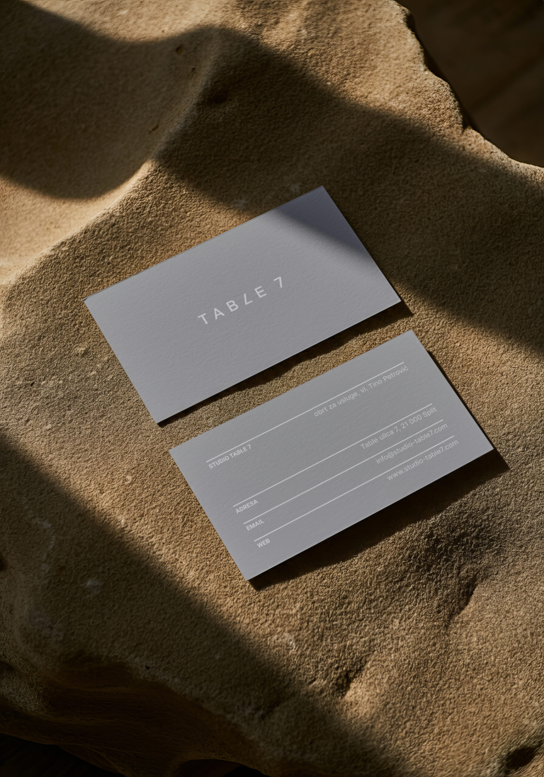
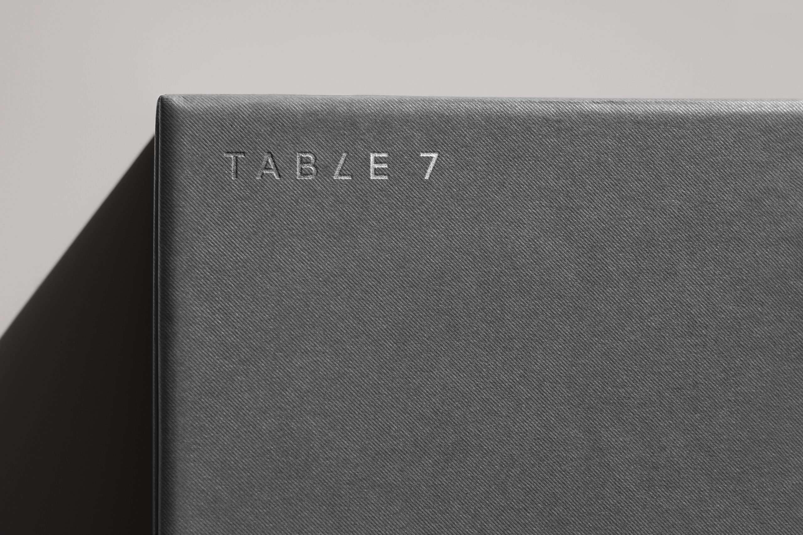
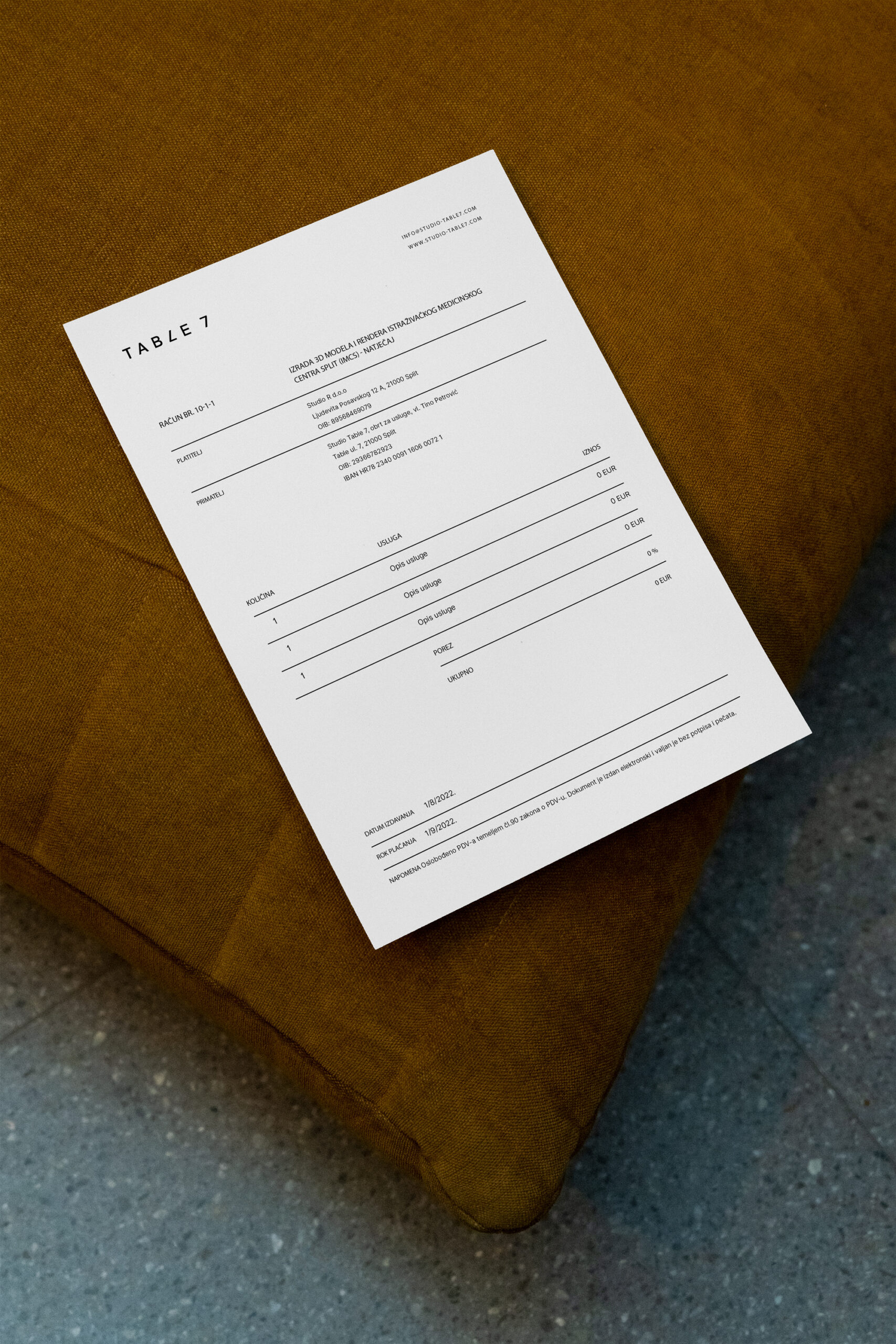
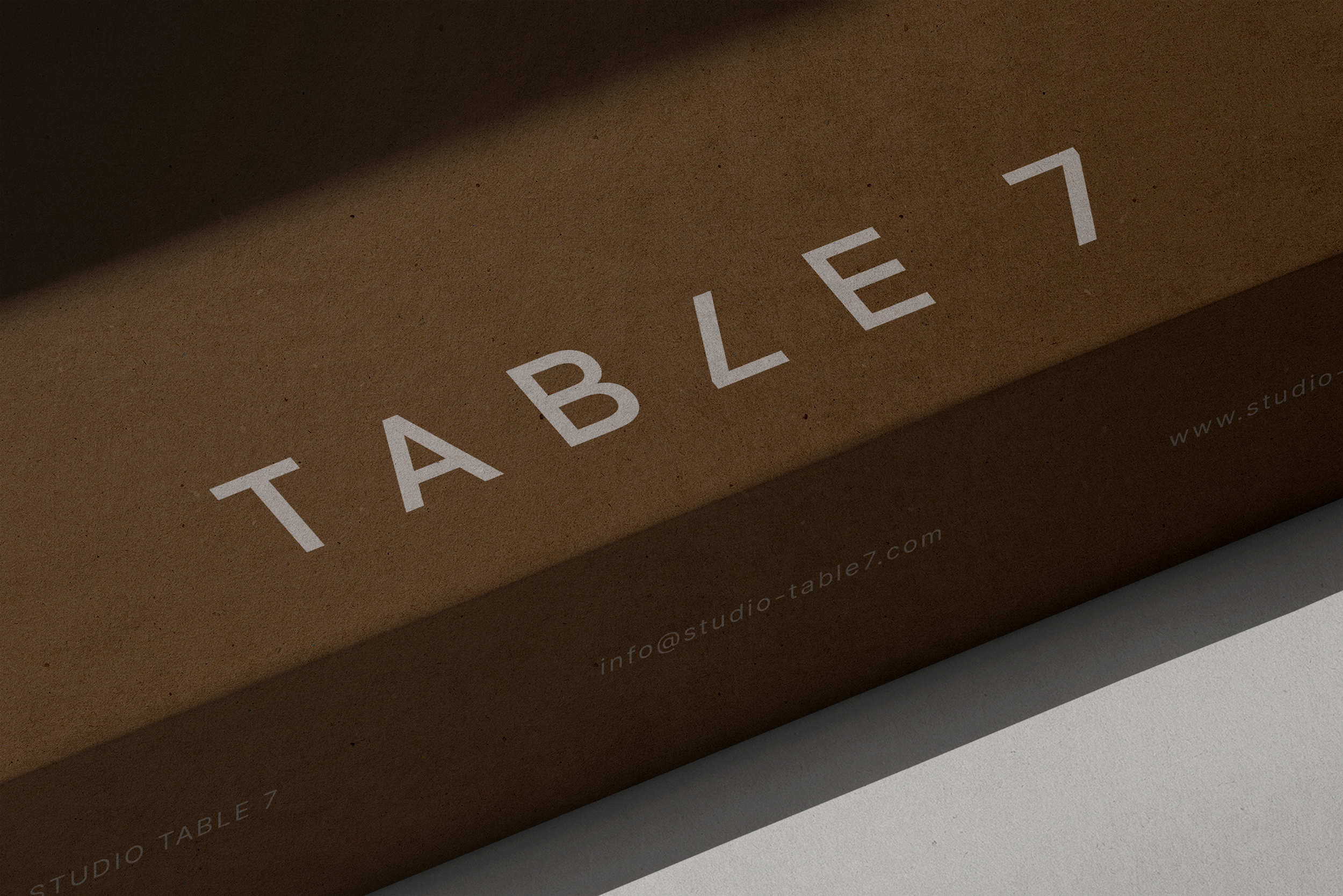
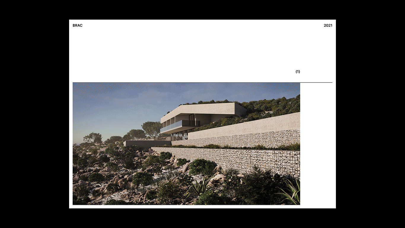
Visual identity for an architectural bureau that needed a flexible identity to showcase a range of projects while maintaining a cohesive, recognizable presence. A simple, effective wordmark maintains a clean aesthetic with a playful twist. The monochromatic color palette, paired with unobtrusive typography, provides a neutral foundation that supports diverse architectural projects. Dividers organize key information, stretching or shrinking to fit different content and subtly referencing spatial interactions within the industry.