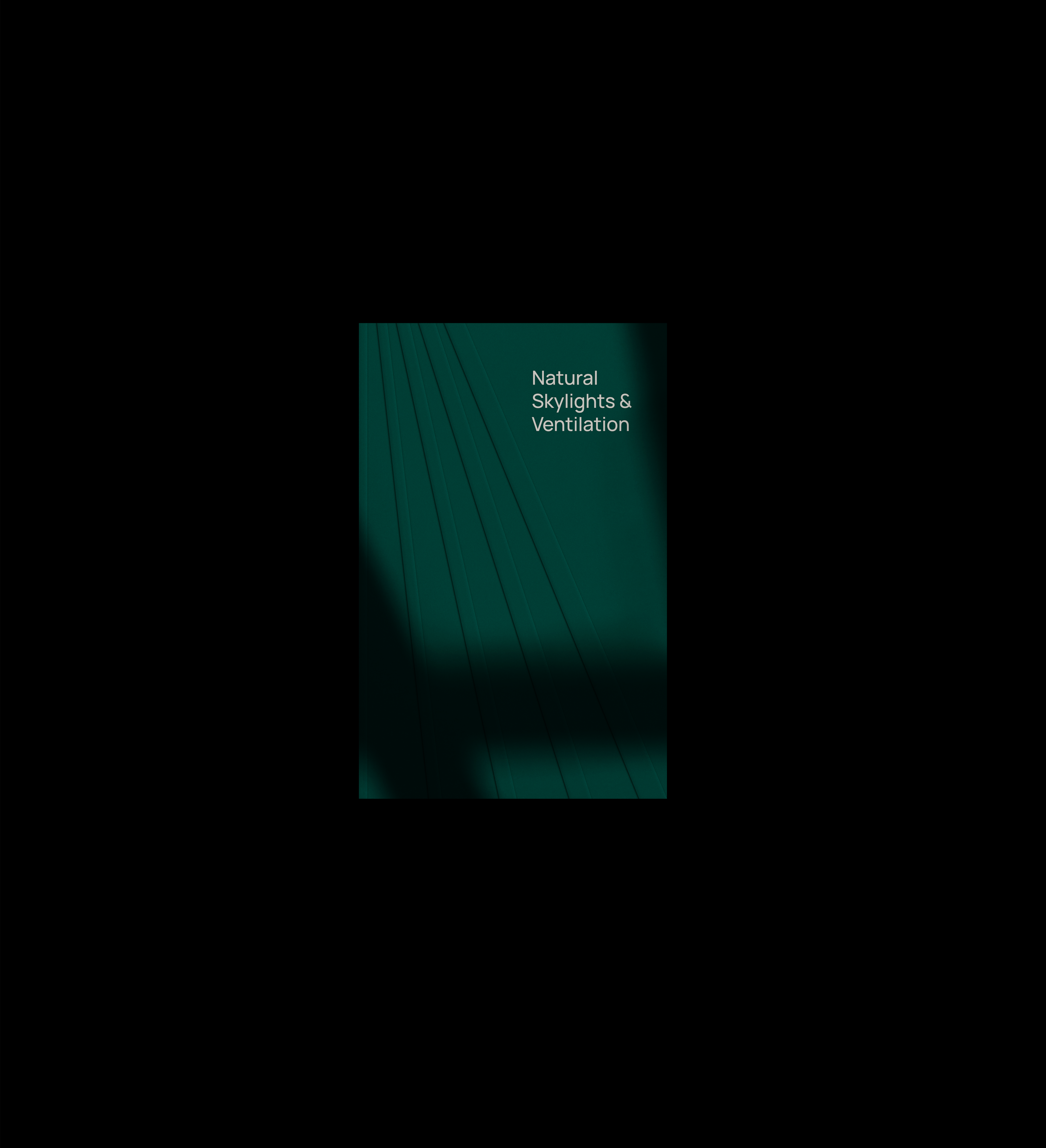
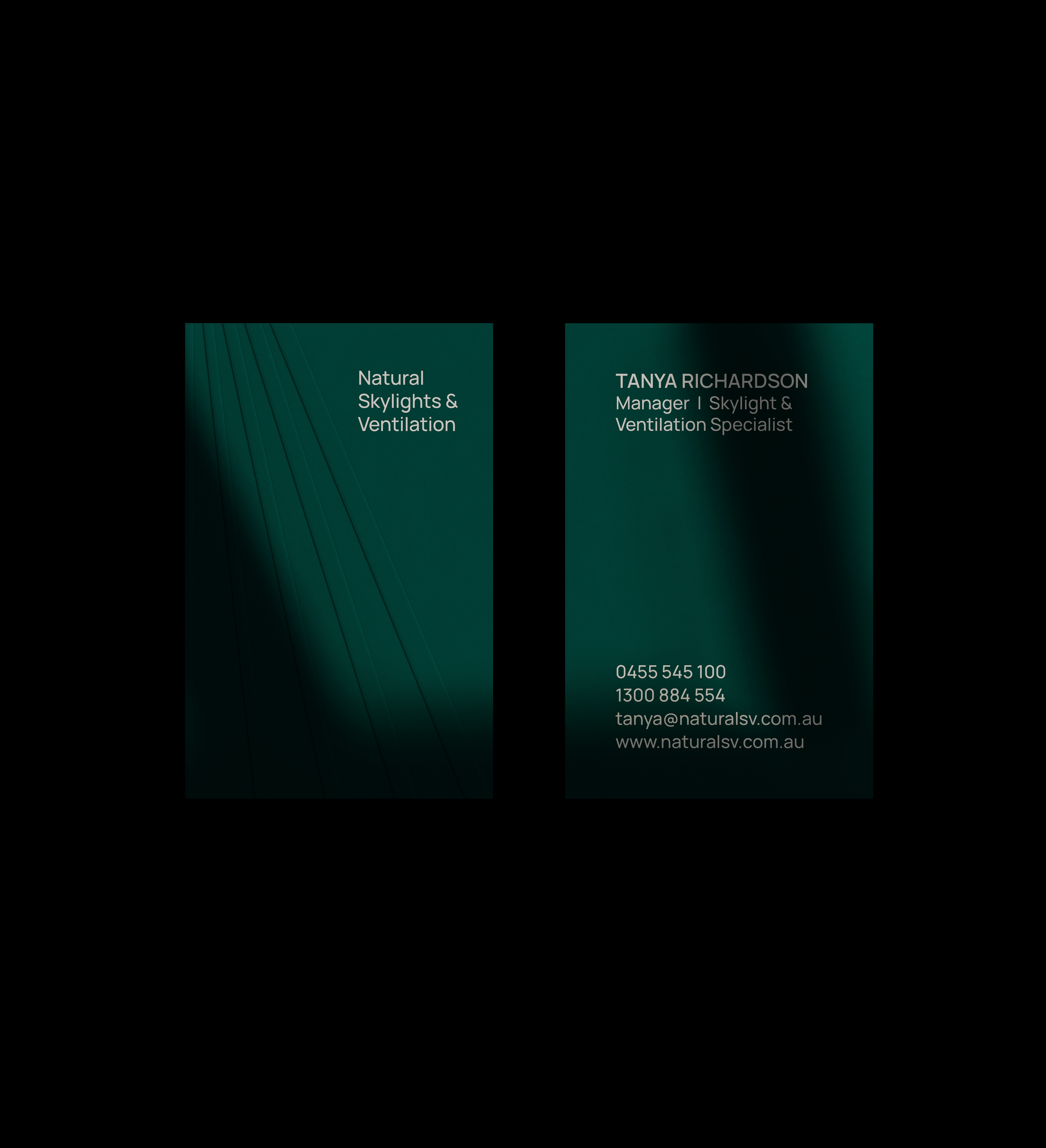
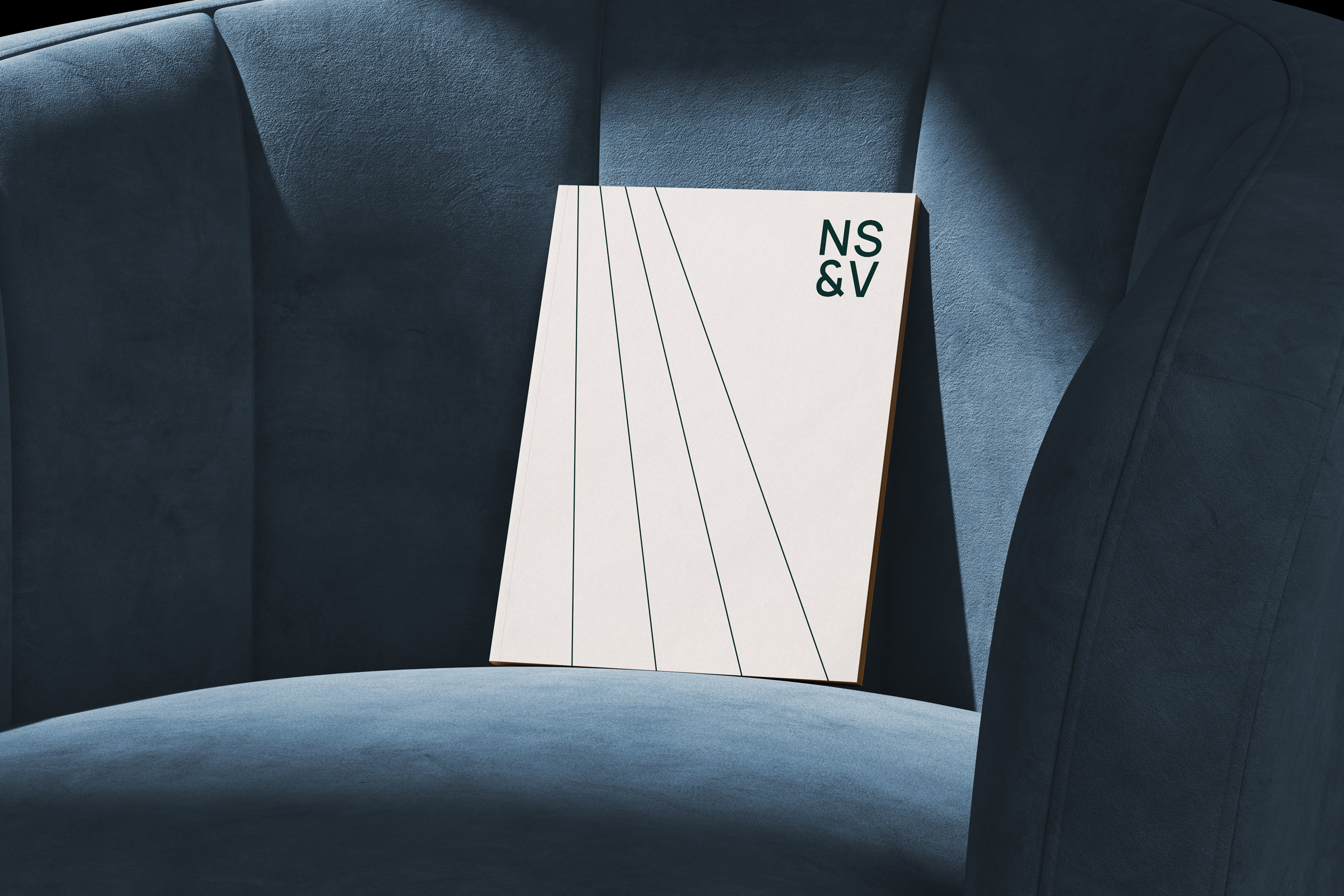
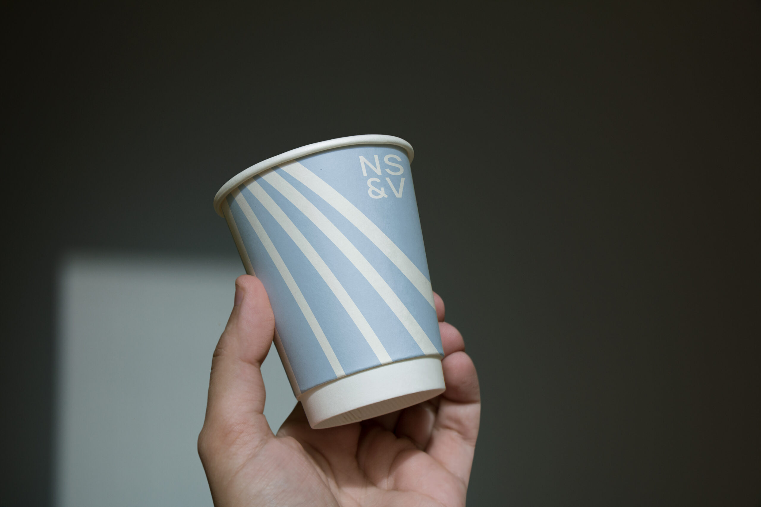
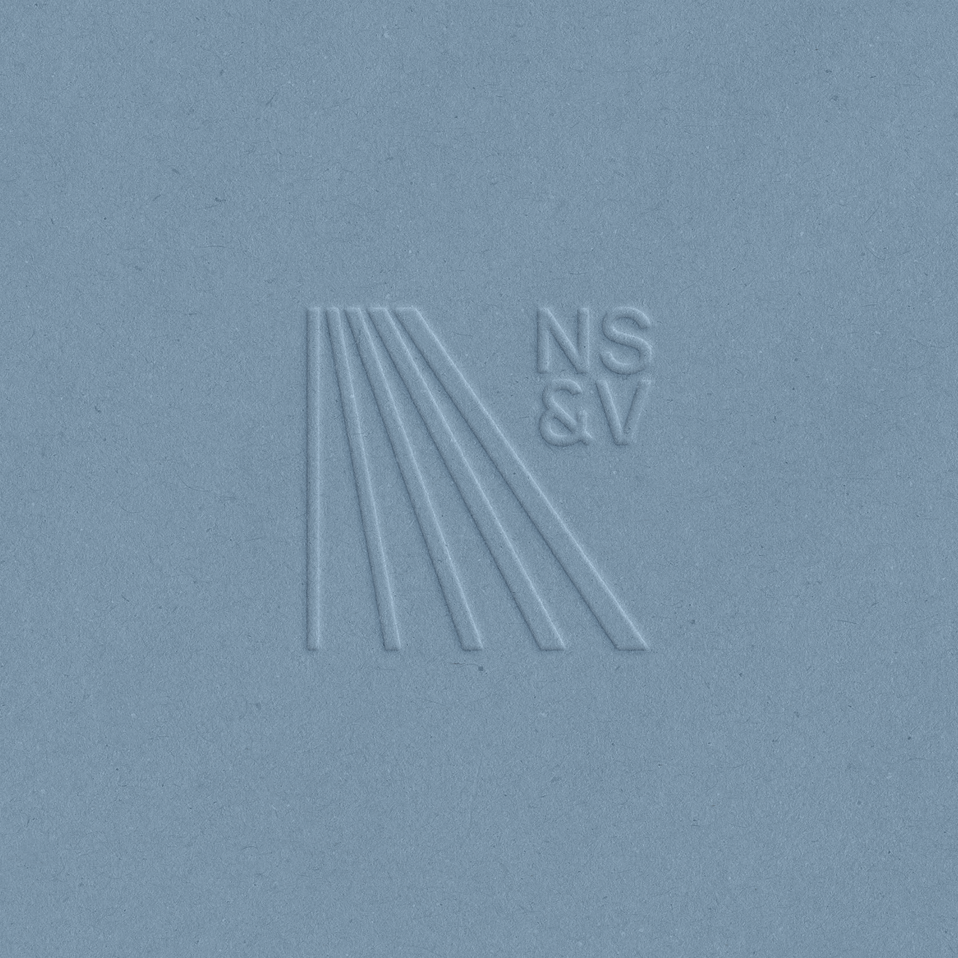
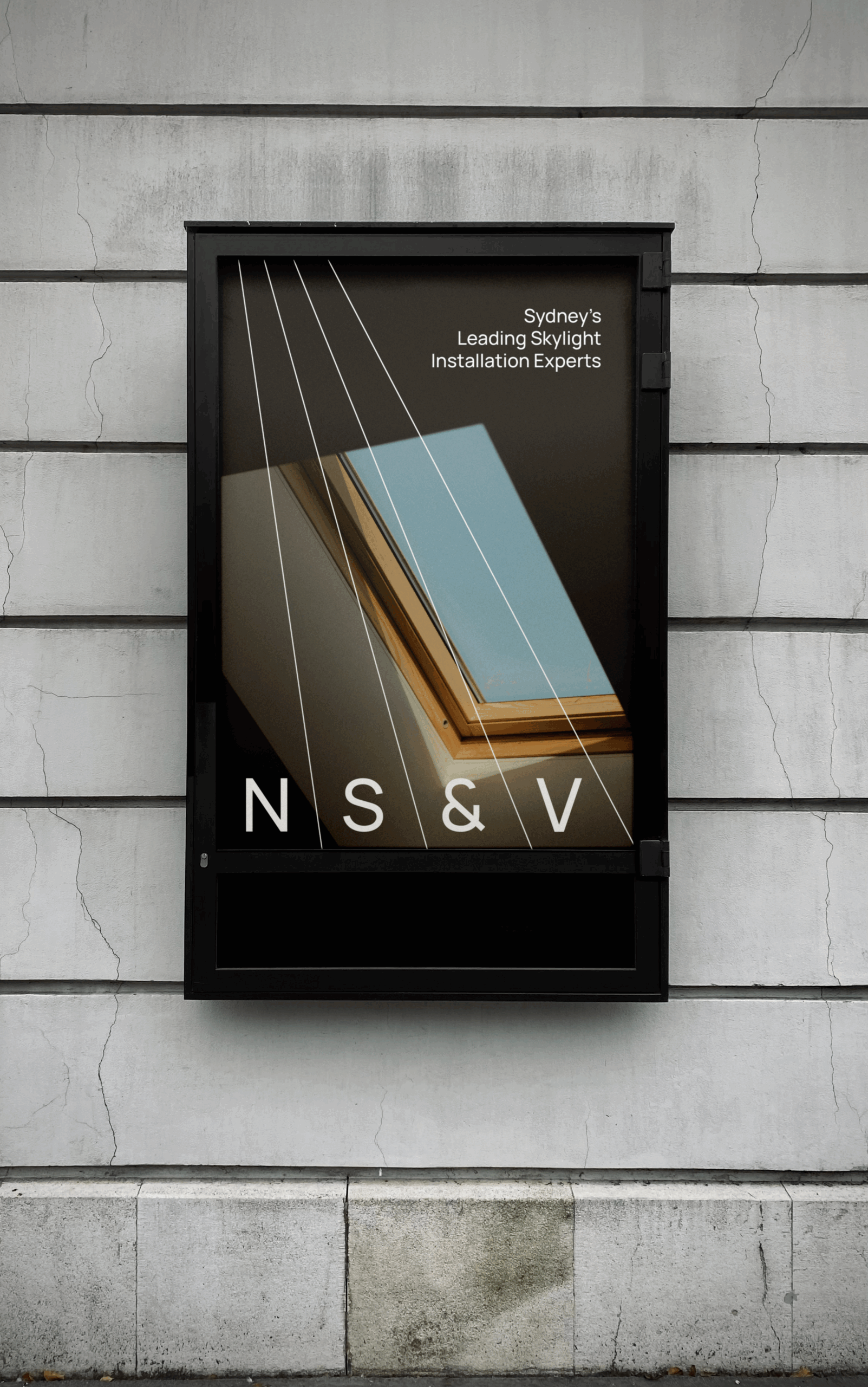
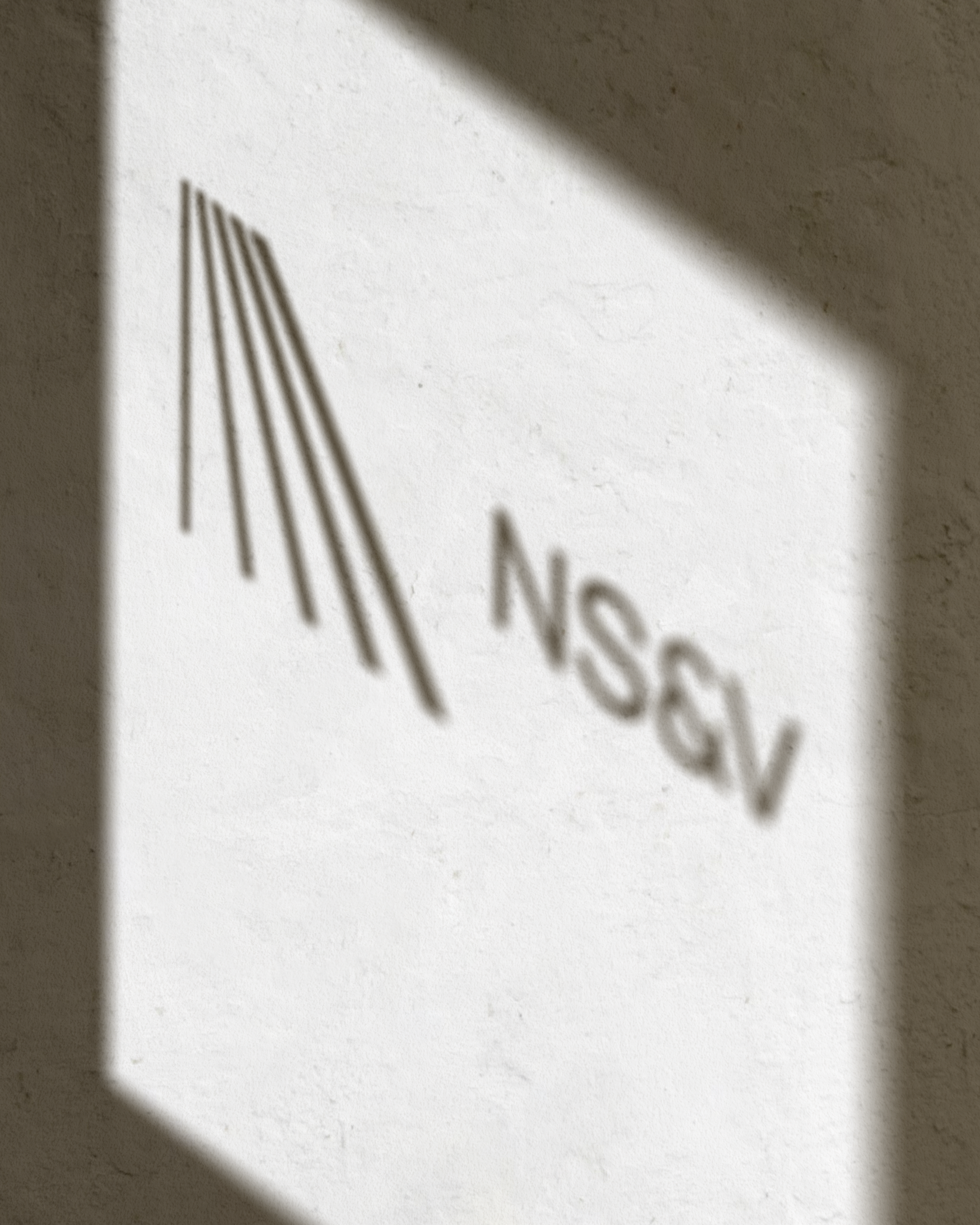
Redesign of the logo and stationery followed the company’s name change from Natural Home Solutions. The change created the need for a new identity that would also position the brand as more premium. Given the long brand name, a key focus was creating a versatile solution adaptable across formats and scales. The redesigned mark is simple and purposeful, with clean lines representing the core service of bringing light and air into interiors. A newly developed palette of green, blue and off-white, inspired by a window view of nature, air and sky, combined with the embossed details on the stationery, reinforces the more premium look and feel the brand was going for.