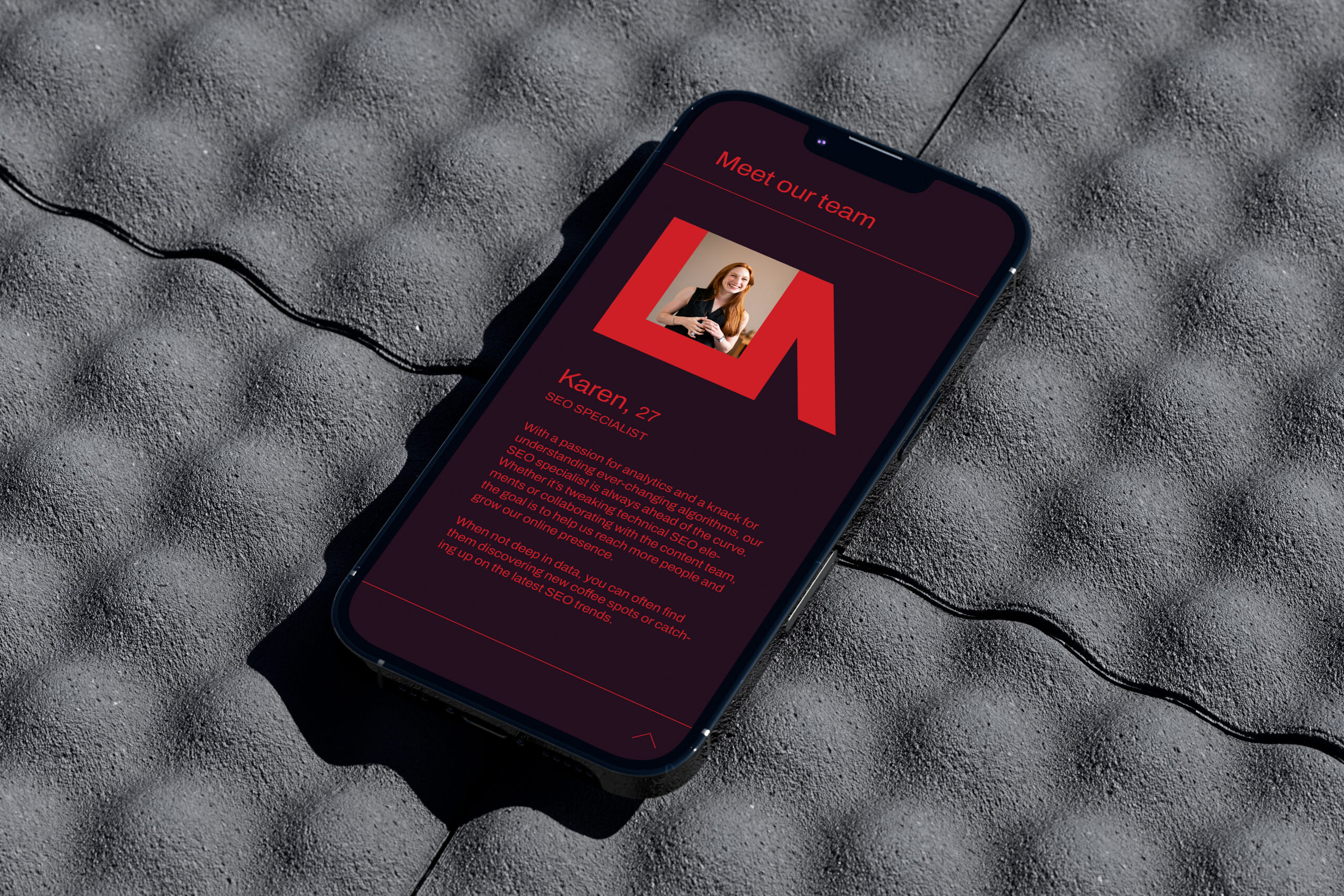
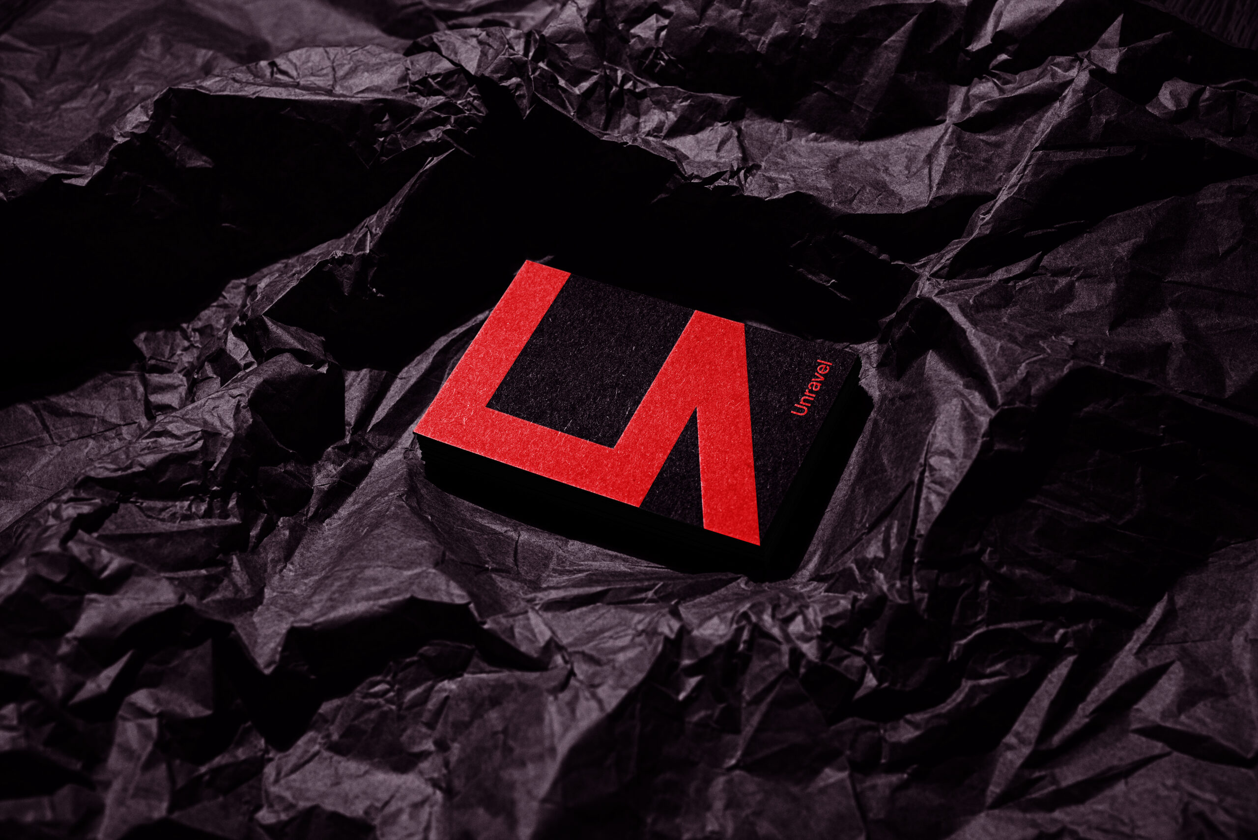
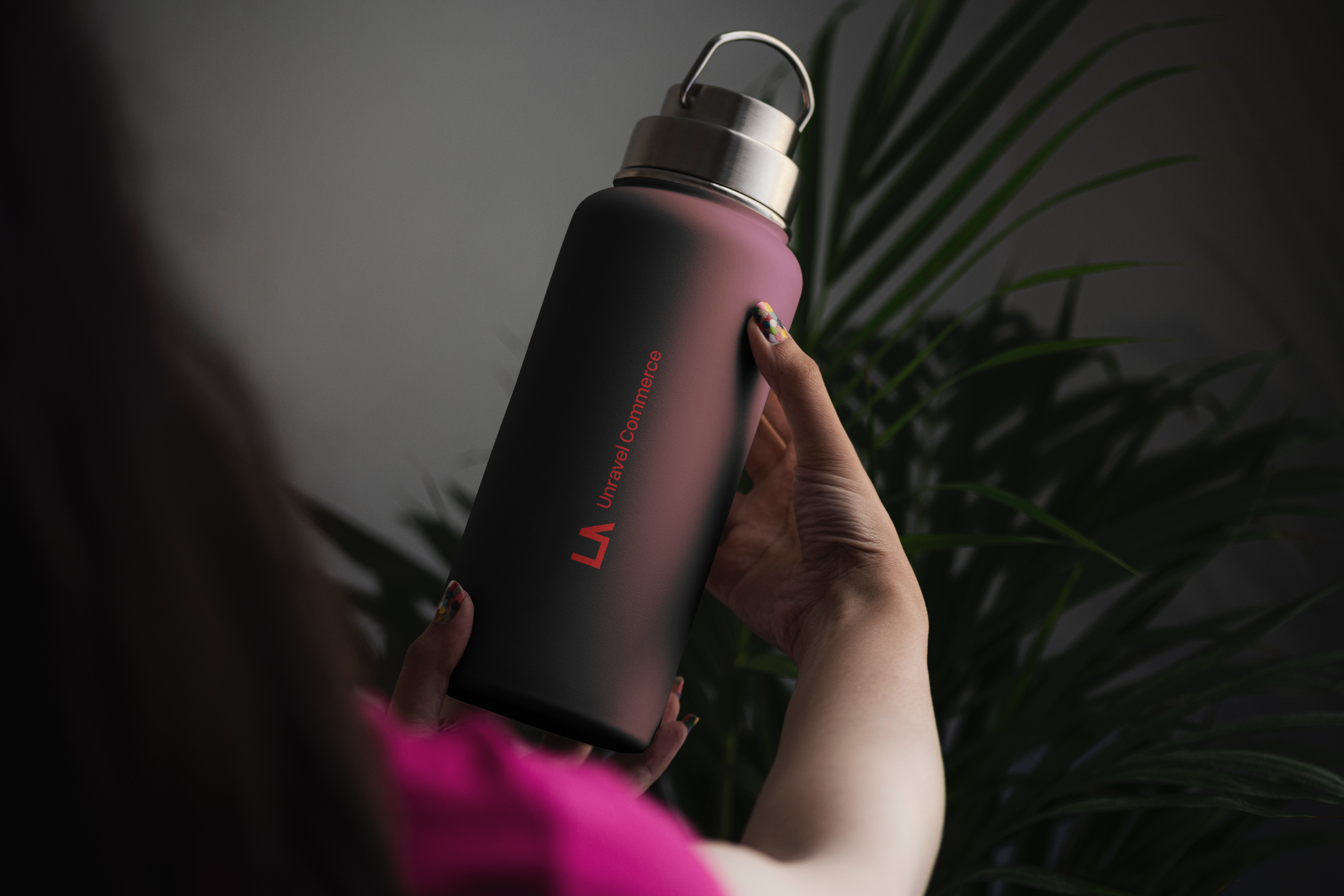
Unravel is a consultancy firm specializing in e-commerce. The goal was to develop a bold, minimalist brand identity that balances professionalism with a playful edge. The logomark is inspired by a box, symbolizing the product-centric nature of e-commerce, with a unique twist: the box unravels into the letter "U," reflecting the brand’s name and mission to simplify complex challenges. Sharp, clean lines give the "U" a modern, versatile form that works seamlessly across brand applications. The bold red, paired with dark aubergine, conveys urgency and confidence, aligning with the company’s core ethos.